Back to work


Branding2025
KEPRO © Spa & Beauty
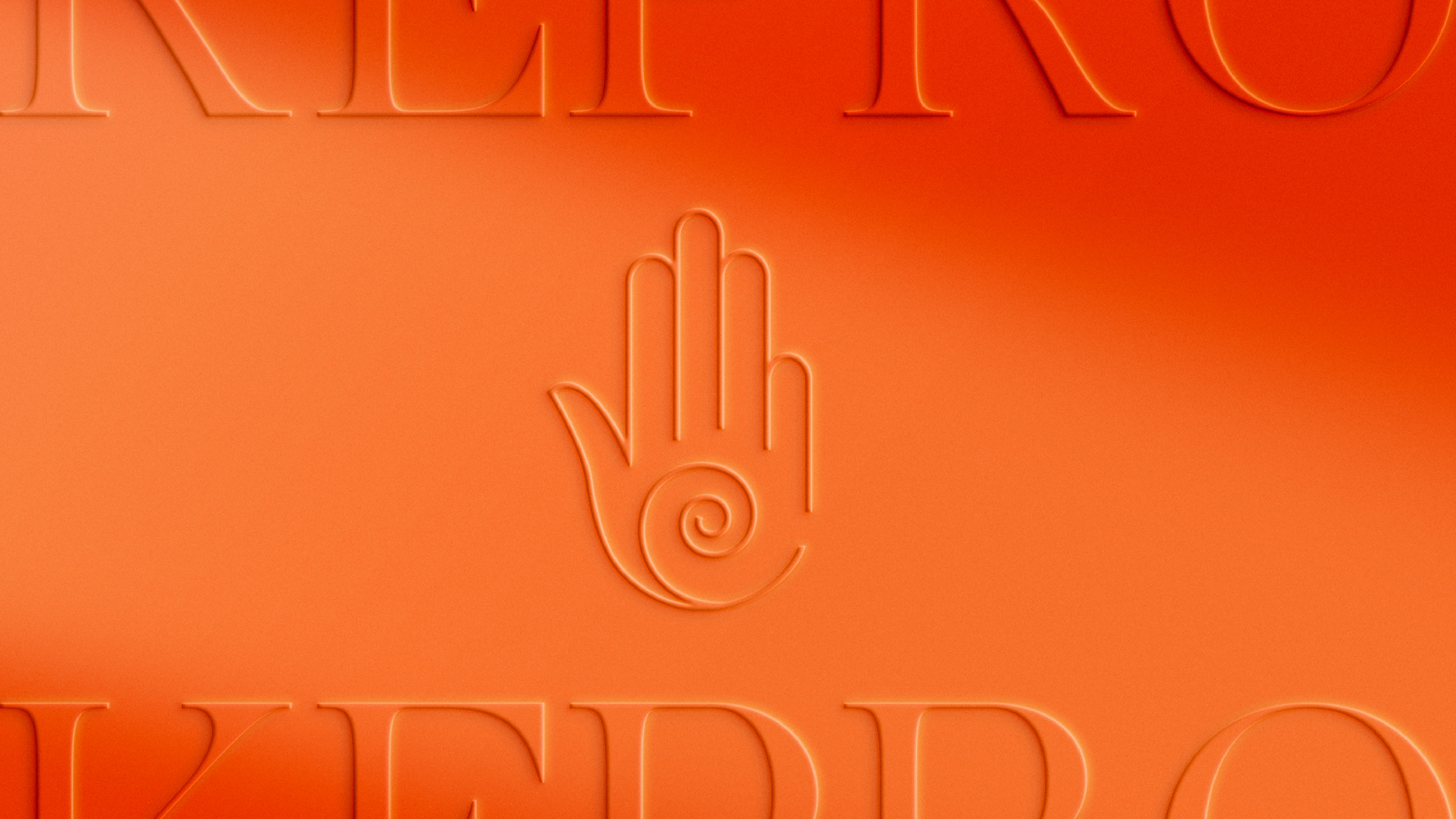
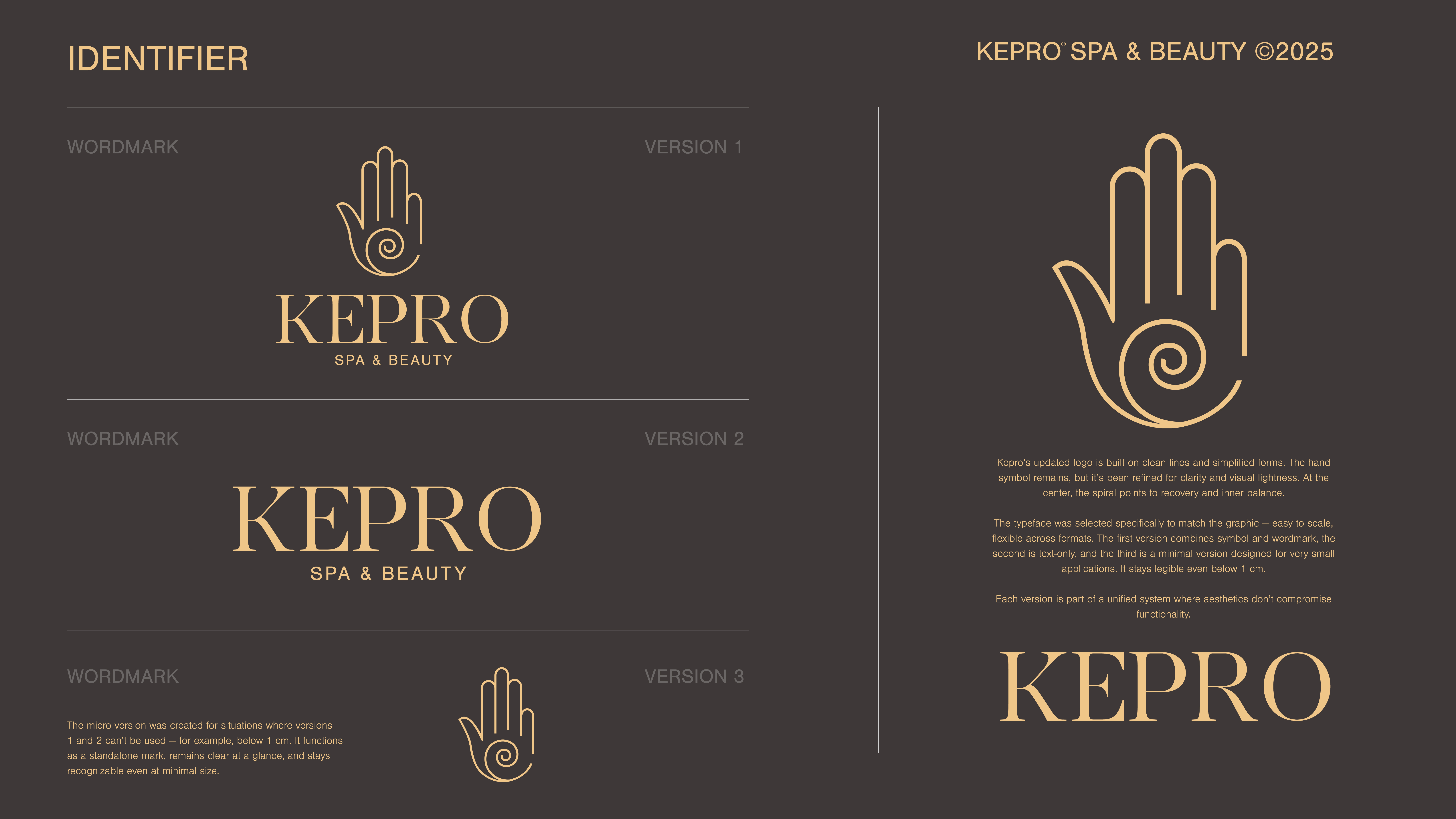
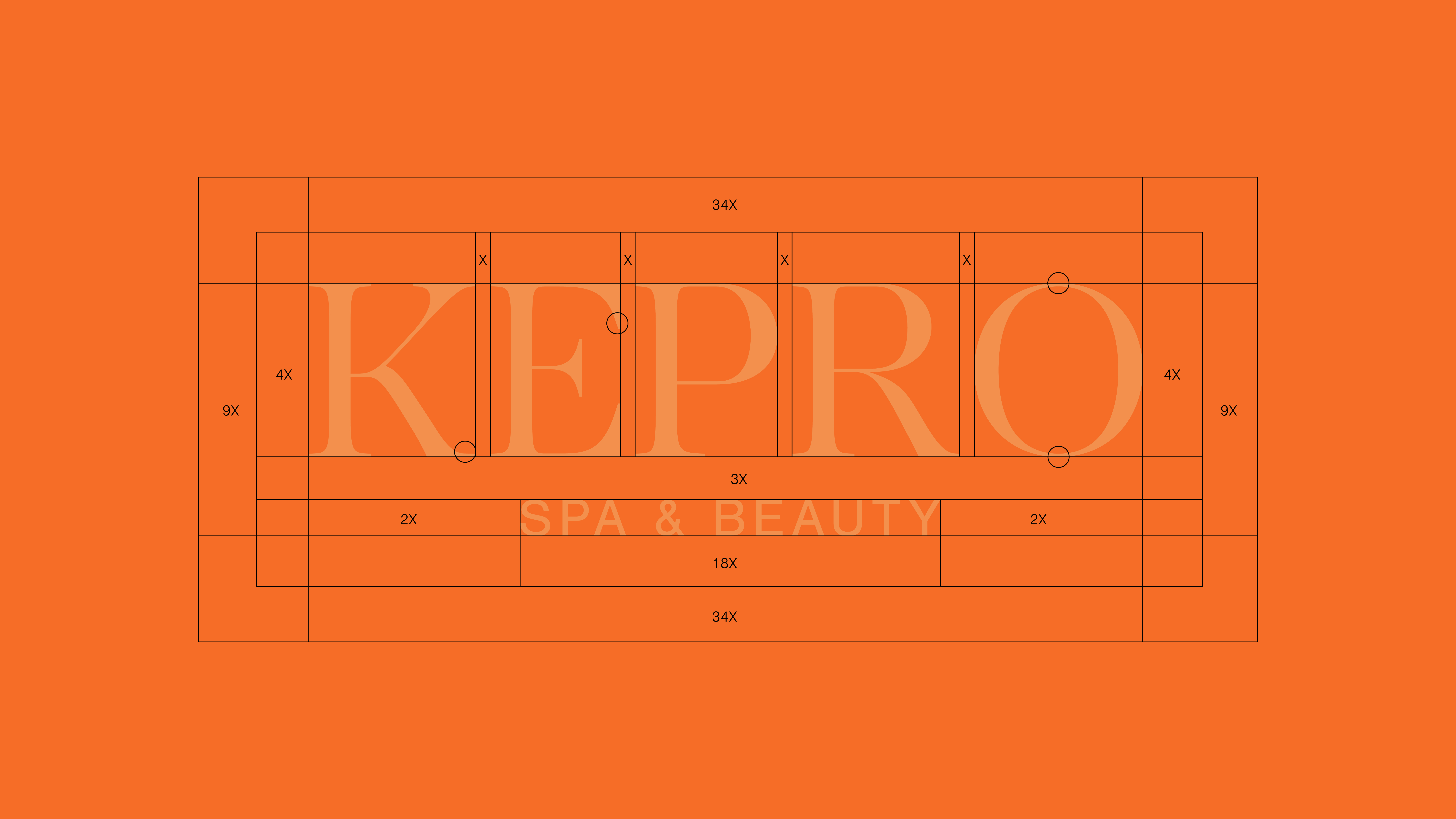
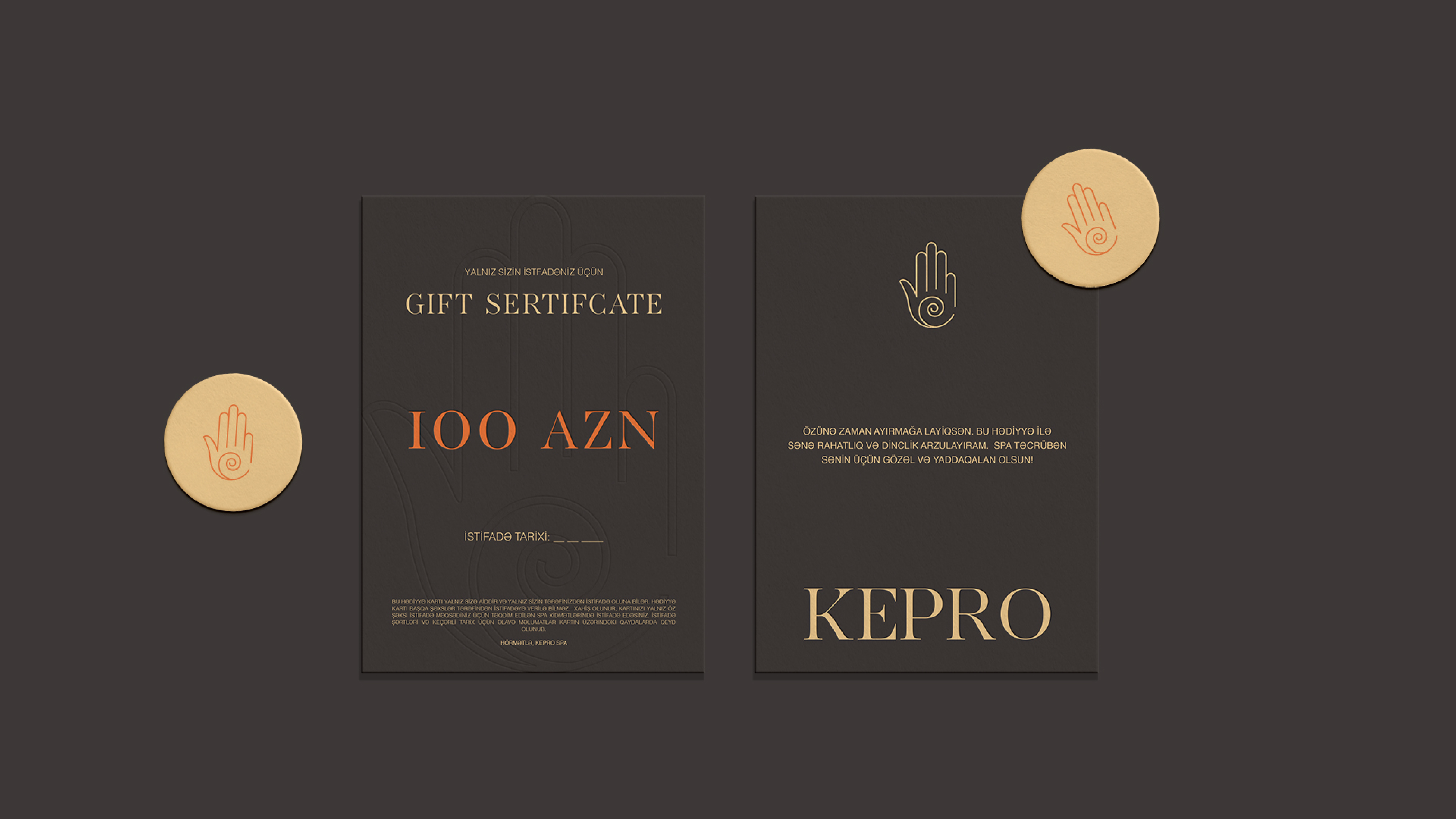
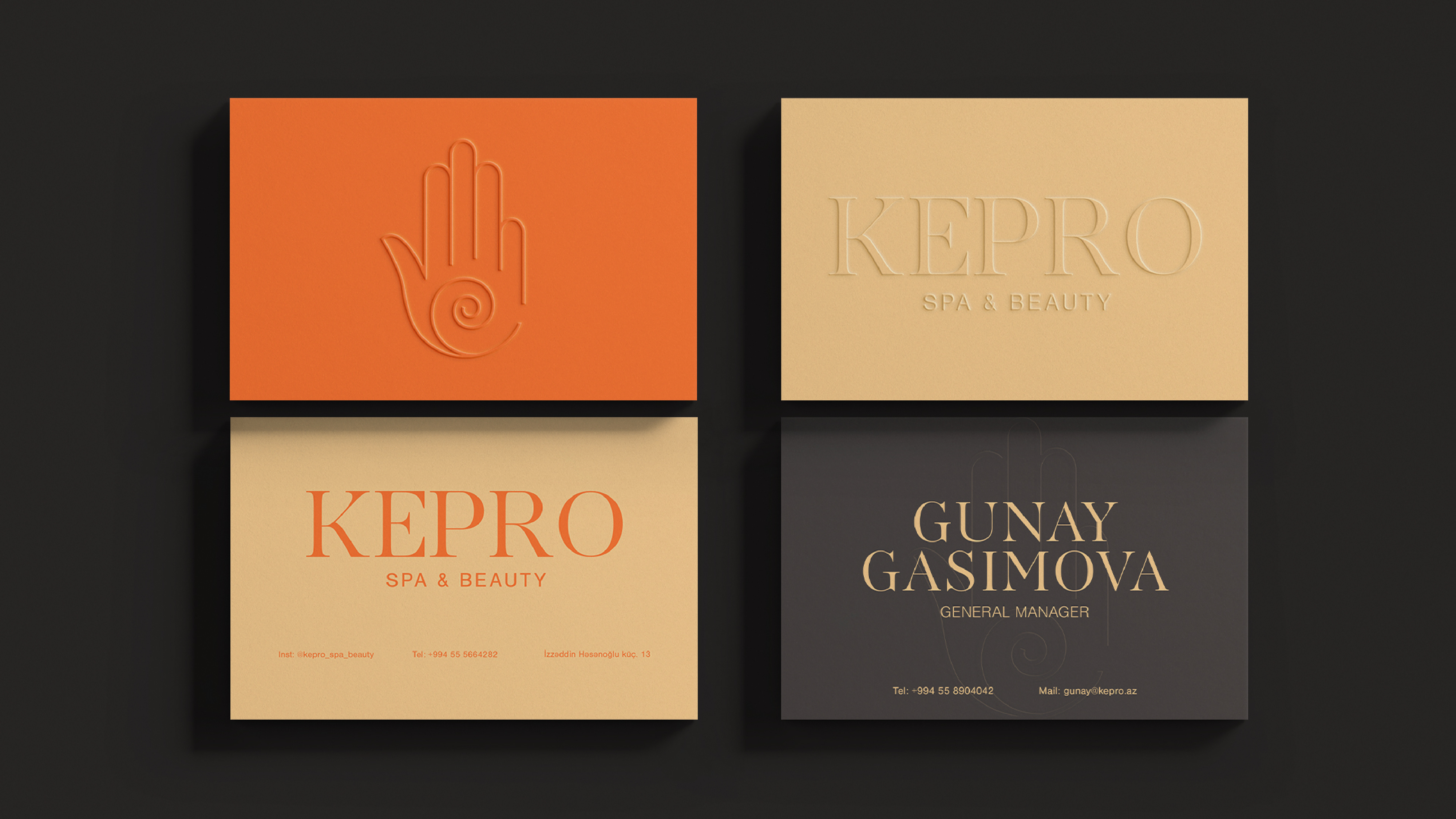
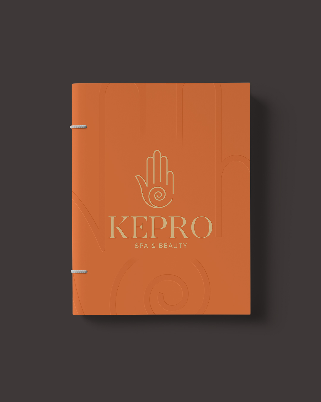
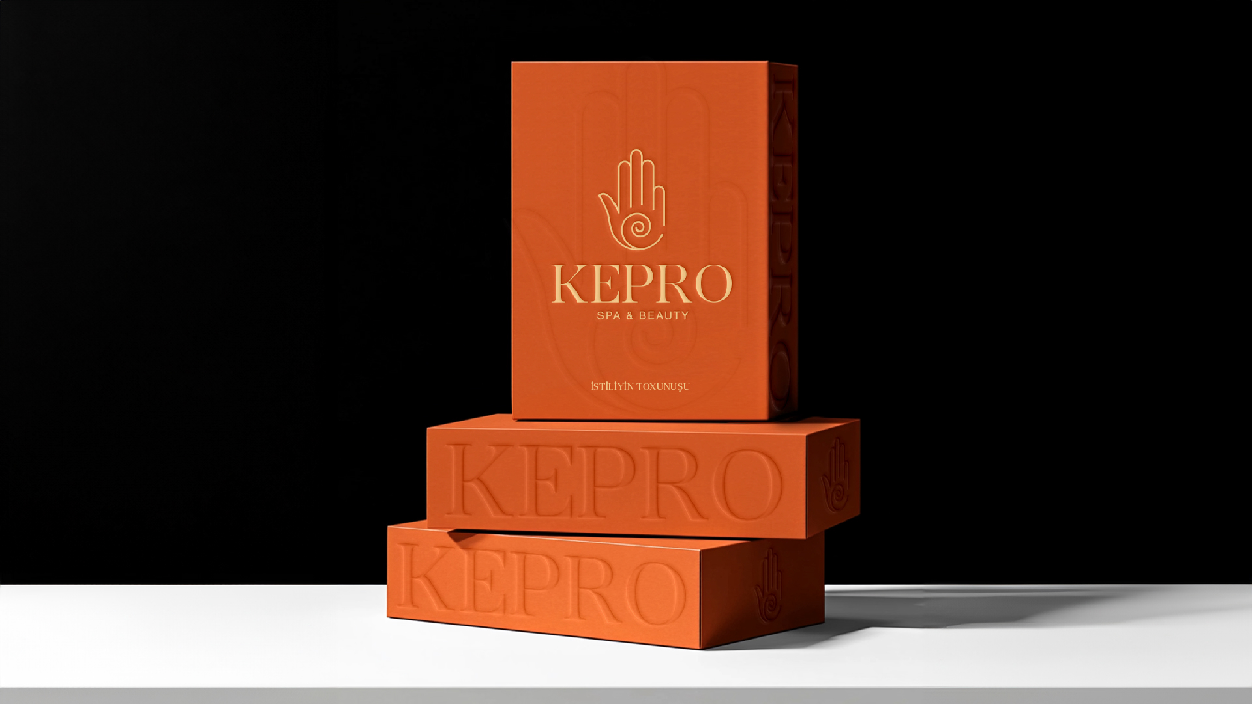
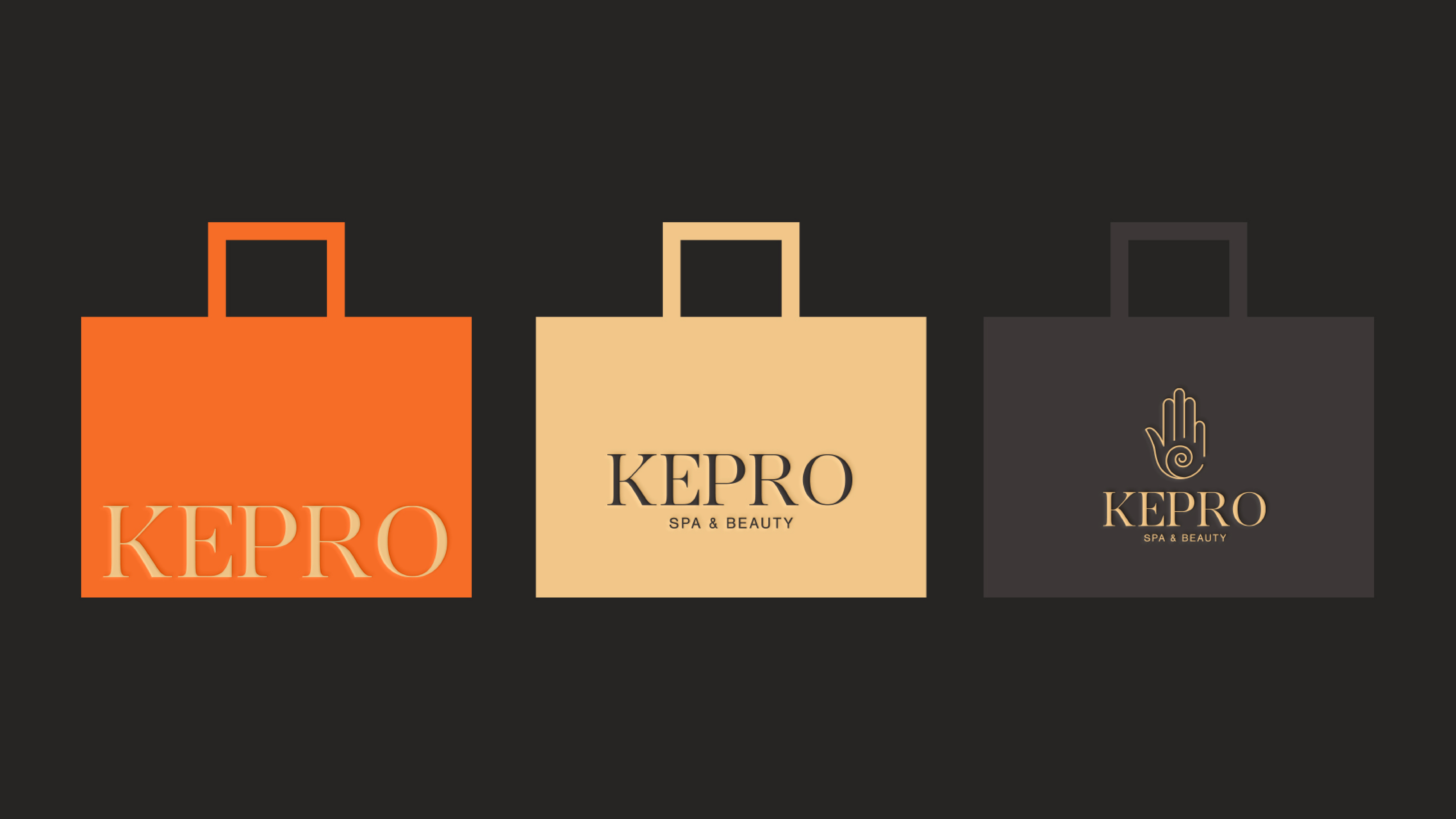
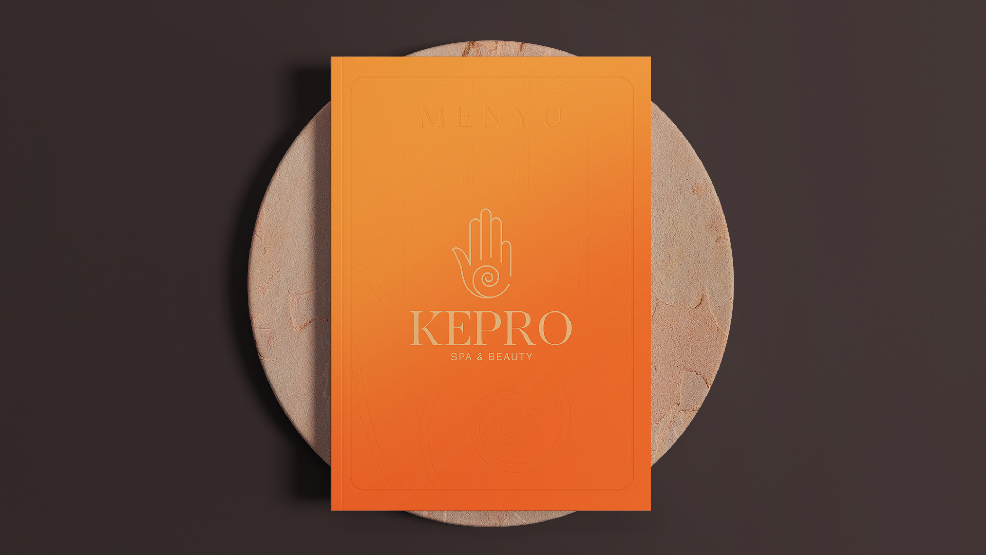
Kepro Spa & Beauty celebrates its 10th anniversary with a refreshed visual identity that keeps its iconic symbol — the hand — now refined with precision. We corrected the curves, adjusted proportions, and rebuilt the form to make it clear, confident, and contemporary.
The hand is not a decorative element. It stands for touch, care, and living energy. The spiral at the center reflects recovery and inner rhythm. It also conveys the idea of a “touch ofwarmth” — both physical, like the comfort of massage or steam, and emotional, expressed through hospitality, care, and calm presence.
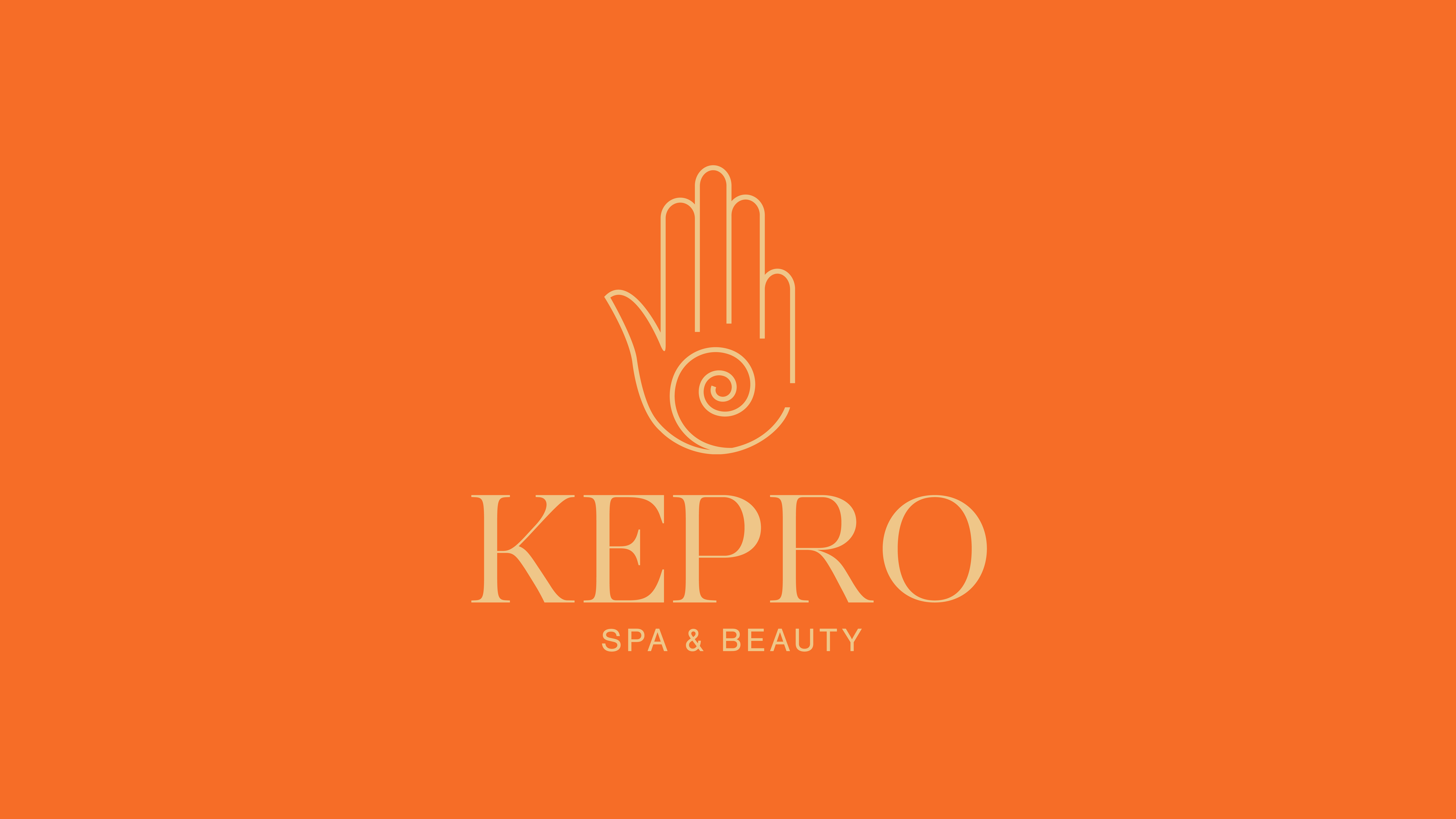
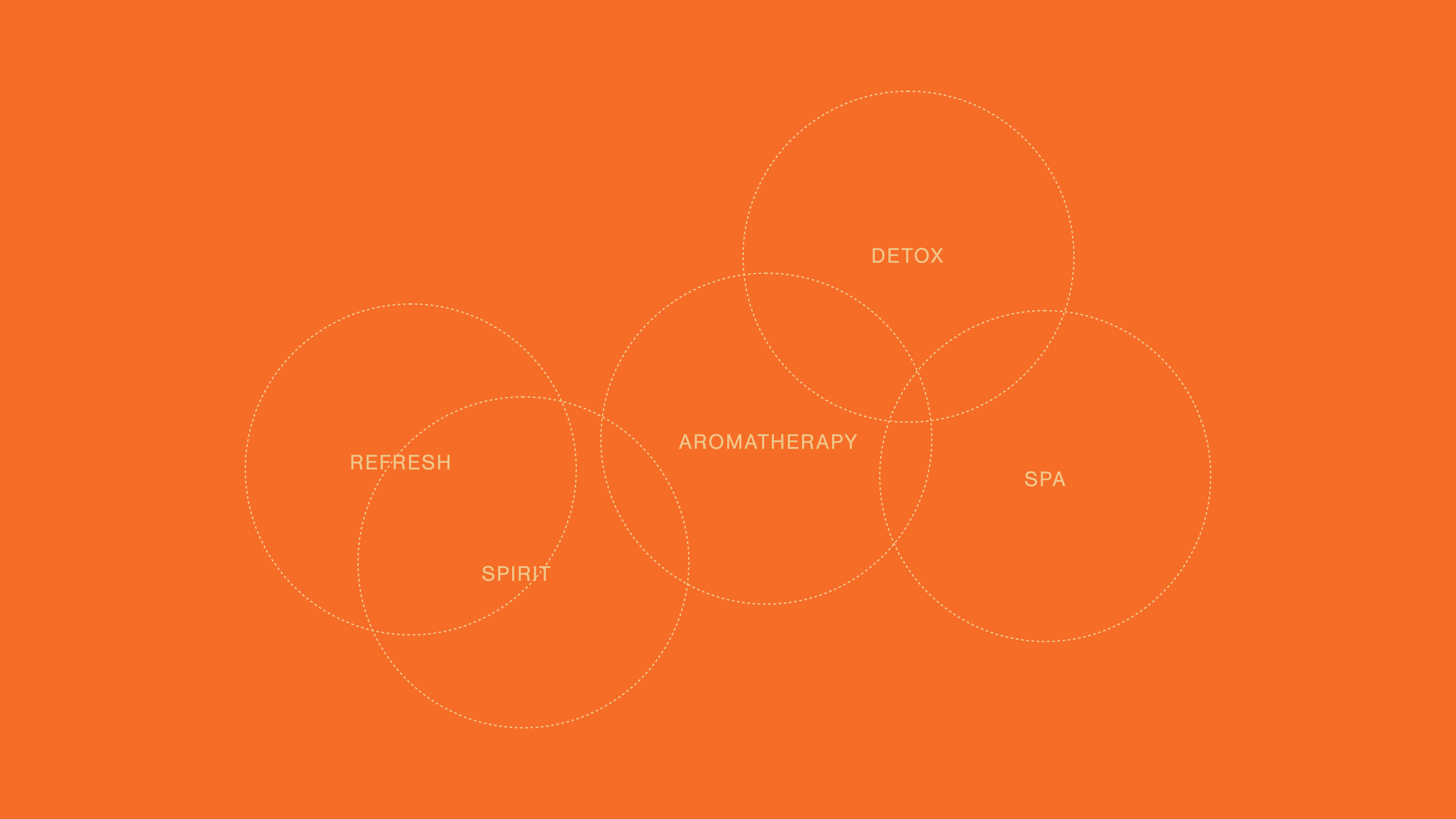
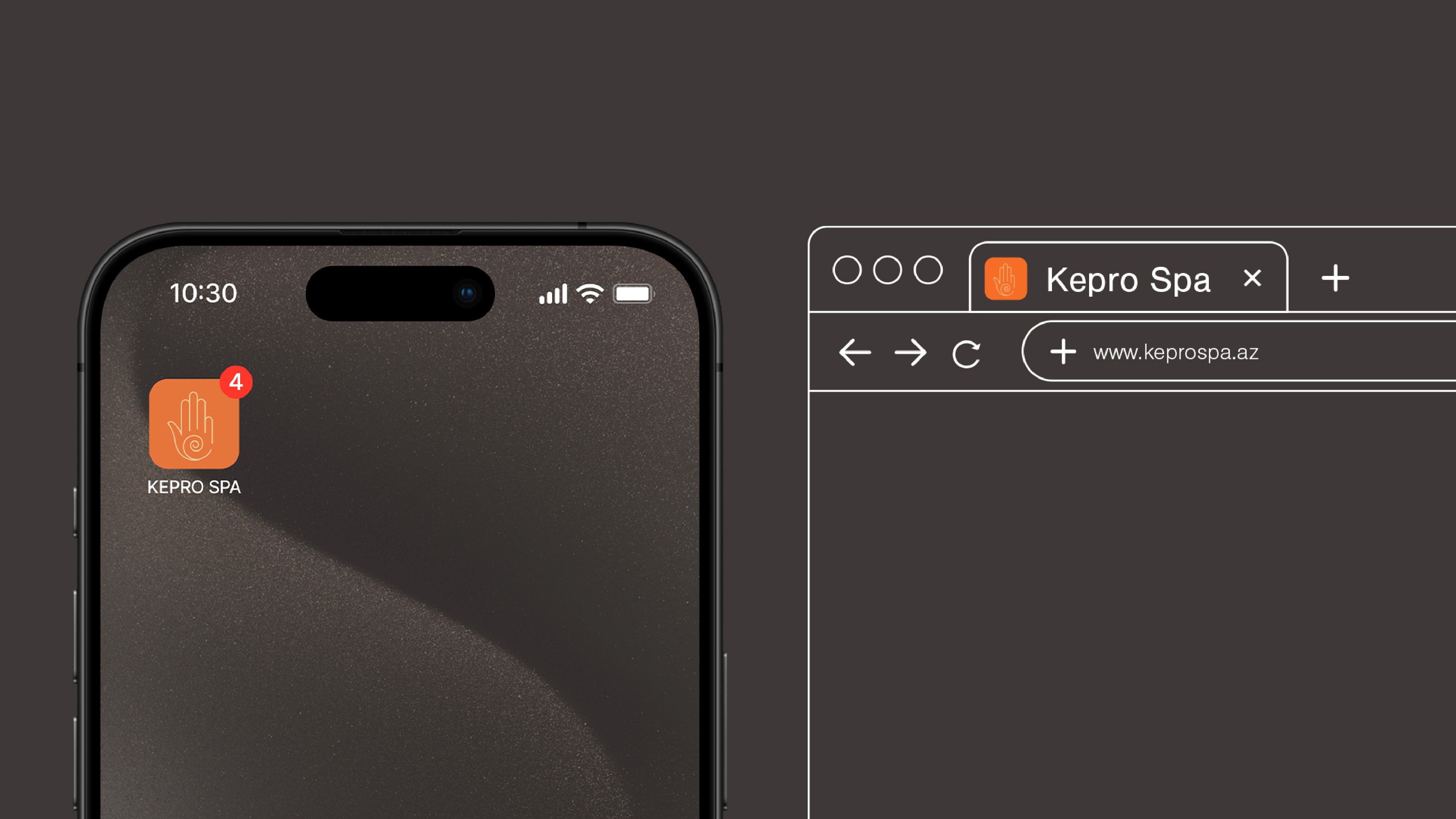
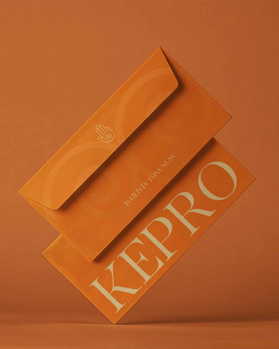
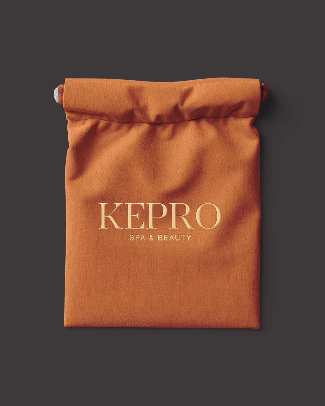
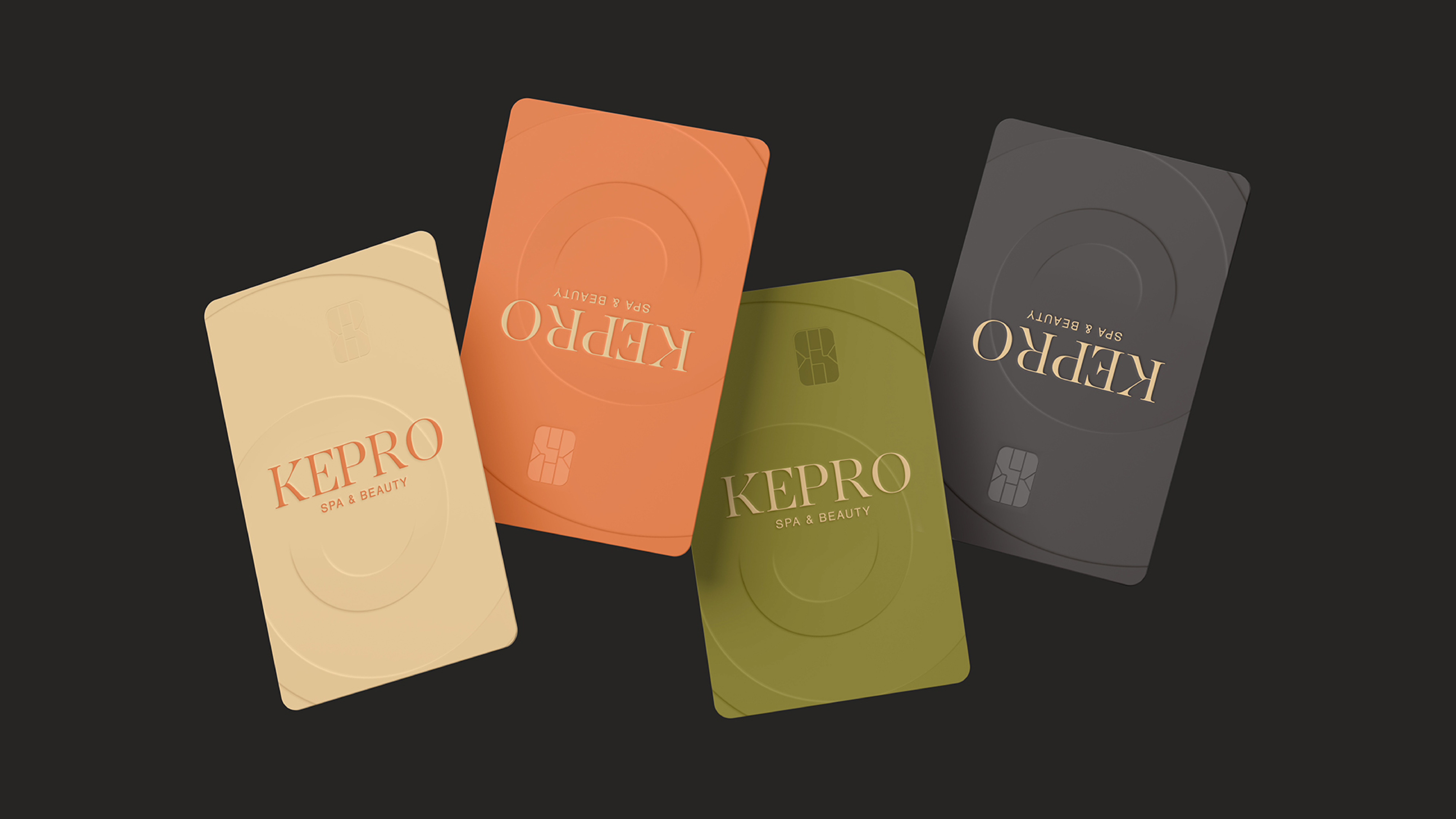
This rebranding became an opportunity to rethink the entire visual system. We introduced a new color palette, updated the typography, and customized the logo — giving it a warmer, lighter, and more refined tone. The new style balances beauty and calm — the two pillars of Kepro’s philosophy.
The update reflects our forward movement in the wellness space. It helps us speak more clearly, appear more grounded, and express our essence: we create spaces that restore, relax, and uplift.